How to use the Slider Module
A slider is a great way to showcase your product, event or feature a highlight on your landing page. The Slider combines images and content can help create a visually appealing highlight on your page.
To add a Slider Module to your landing page, click the grey (+) button in the landing page builder. Once the module has been added, you’ll be able to add content for each page in your slider.
Customize your module
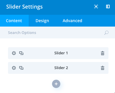
Each page of the sliders can be customized individually by clicking on the settings wheel next to the page slider name.
For each page of the slider, you can edit the Text, add a link for CTA button, add a background image, or video.
In addition, the Slider module has three areas to customize your content:
- Content
- Design
- Advanced
Content
The content options of your Slider Module will consist of three categories :
Elements
Choose whether to show the controls and arrows on your slider.
Background
Set a default color or background image for your module. This default will display if each page of your slider does not use an individual color or image.
Admin Label
This will change the label of the module in the builder for easy identification
Design
The design options will allow you to change the appearance of your slider to match the appearance and tone being used on your landing page.
Layout
Toggle on or off the option of a shadow.
Text
Set an orientation and add a shadow to your text. Design options here will take effect for all your text.
Title Text
Change the font, weight, size, spacing and more! Changes to the size and spacing will change the size of your slider module.
Body Text
Change the font, weight, size, spacing and more! Changes to the size and spacing will change the size of your slider module.
Button
Toggle the option to Use Custom Styles for Button and have a fully customizable button for your pricing table including adding a hover icon, changing the color and more!
Sizing
This is the sizing for your entire slider module. If the size goes below 100% on the slider, options for aligning your module left, center or right will automatically appear.
Spacing
Add customized margins or padding here.
Border
Set the border radius, style, width and color of your slider module.
Box Shadow
Add a shadow behind your module.
Filters
Define your color saturation, the contrast of light and dark areas, add a sepia filter or blur your entire module. Lots of options for filters in this section. Blend Mode allows you to modify how your image blends with any other layers beneath it. Choose normal to return to the default option.
Animation
Pick an animation style to enable animations for your image module. Each animation will allow you to customize it further, controlling duration, direction, and intensity.
Advanced
Within the advanced tab, you will find options such as custom CSS and HTML attributes. Here you can apply custom CSS to any of the modules many elements. You can also apply custom CSS classes and IDs to the module.
CSS ID and Classes
Enter an optional CSS ID to be used for this module. An ID can be used to create custom CSS styling or to create links to particular sections of your page. Enter optional CSS classes to be used for this module. A CSS class can be used to create custom CSS styling. You can add multiple classes, separated with a space.
Custom CSS
Custom CSS can also be applied to the module and any of the modules internal elements. Within the Custom CSS section, you will find a text field where you can add custom CSS directly to each element.
CSS input into these settings are already wrapped within style tags, so you need only enter CSS rules separated by semicolons.
Visibility
This option lets you control which devices your module appears on. You can choose to disable your module on tablets, smartphones or desktop computers individually. This is useful if you want to use different modules on different devices, or if you want to simplify the mobile design by eliminating certain elements from the page.