How to add the Testimonial Module
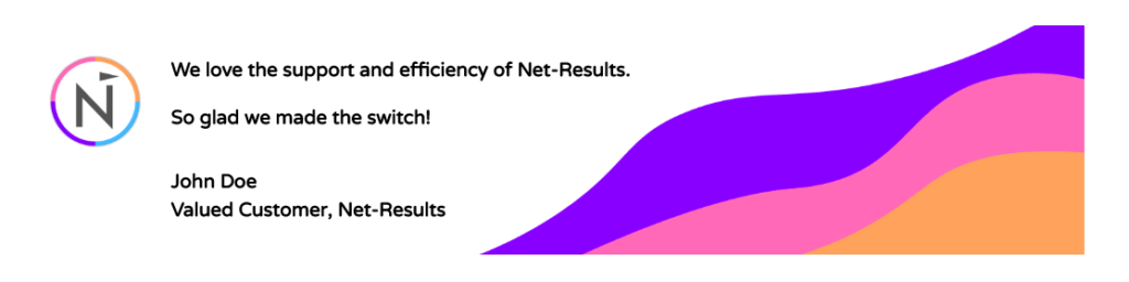
The Testimonial Module is an excellent way to highlight positive reviews or a blurb from someone of note on your landing page.
To add a Testimonial Module to your landing page, click the grey (+) button in the landing page builder. Once the module has been added, you’ll be able to add content and customize your module.
Content
The content options of your Testimonial Module will consist of six categories :
Text
Add the content of your module including the author’s name, their blurb and their job title.
Image
Upload an image or icon for your testimonial.
Link
Input the website of the author leave blank to not include a link.
Elements
Choose to show or hide the quote icon.
Background
Add a background color or image to your module.
Admin Label
This will change the label of the module in the builder for easy identification.
Design
The design options will allow you to change the appearance of your testimony module to match the appearance and tone being used on your landing page.
Quote Icon
Set an icon color and background color for the quote icon.
Text
Set the text color of your module to light or dark and select the orientation and add a shadow to your text.
Image
Customize how the portrait icon renders in your module. Set the height, add a border, and more!
Body Text
Additionally, customize the text of your module but choosing the font, size and spacing. If the size and spacing are changed, the module will adjust size to fit the font.
Sizing
This is the sizing for your entire slider module. If the size goes below 100% on the slider, options for aligning your module left, center or right will automatically appear.
Spacing
Add customized margins or padding here.
Border
Set the border radius, style, width and color of your slider module.
Box Shadow
Add a shadow behind your module.
Filters
Define your color saturation, the contrast of light and dark areas, add a sepia filter or blur your entire module. Lots of options for filters in this section. Blend Mode allows you to modify how your image blends with any other layers beneath it. Choose normal to return to the default option.
Animation
Pick an animation style to enable animations for your image module. Each animation will allow you to customize it further, controlling duration, direction, and intensity.
Advanced
Within the advanced tab, you will find options such as custom CSS and HTML attributes. Here you can apply custom CSS to any of the modules many elements. You can also apply custom CSS classes and IDs to the module.
CSS ID and Classes
Enter an optional CSS ID to be used for this module. An ID can be used to create custom CSS styling or to create links to particular sections of your page. Enter optional CSS classes to be used for this module. A CSS class can be used to create custom CSS styling. You can add multiple classes, separated with a space.
Custom CSS
Custom CSS can also be applied to the module and any of the modules internal elements. Within the Custom CSS section, you will find a text field where you can add custom CSS directly to each element.
CSS input into these settings are already wrapped within style tags, so you need only enter CSS rules separated by semicolons.
Visibility
This option lets you control which devices your module appears on. You can choose to disable your module on tablets, smartphones or desktop computers individually. This is useful if you want to use different modules on different devices, or if you want to simplify the mobile design by eliminating certain elements from the page.