What the Video Slider is
Want to add some additional excitement and interactivity to your pages? Adding a video will not only make your landing page more memorable, it will also give you a higher percentage of conversions from site visitors. With the Video Slider module, you can add multiple videos to your site and change their effects.
Adding the Video Slider
To add a Video Module to your landing page, click the grey (+) button in the landing page builder. Once the module has been placed in the row of your choosing, you’ll be able to add individual videos to your module by clicking on the grey (+) button on the Content Tab of the module settings.
In addition to customizing the module, each video will have a set of customizations that allow you to add your video url, choose the displayed image and customize the arrow to scroll through to the next video. You can access these settings by clicking the settings while next to each individual module.
To Customize your entire module you have three areas of options:
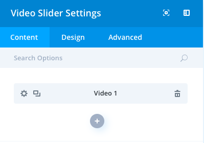
- Content
- Design
- Advanced
Content
The Content portion of your video slider module is where you can designate the video used, the image you’d like your visitors to see prior to pressing play, and the administration label your team will use to identify your video.
Elements
Control the display of arrows and controls on your slider.
Overlay
Choose to have an image overlay and cover the UI on your main video.
Background
Add a background image or color to your slider.
Admin Label
This will change the label of the module in the builder for easy identification by you and your team.
Design
Controls Colors
Choose the colors of the play and arrow icons for your videos.
Sizing
This is the sizing for your entire slider module. If the size goes below 100% on the slider, options for aligning your module left, center or right will automatically appear.
Spacing
Add customized margins or padding here.
Border
Set the border radius, style, width and color of your slider module.
Box Shadow
Add a shadow behind your module.
Filters
Define your color saturation, the contrast of light and dark areas, add a sepia filter or blur your entire module. Lots of options for filters in this section. Blend Mode allows you to modify how your image blends with any other layers beneath it. Choose normal to return to the default option.
Animation
Pick an animation style to enable animations for your image module. Each animation will allow you to customize it further, controlling duration, direction, and intensity.
Advanced
Within the advanced tab, you will find options such as custom CSS and HTML attributes. Here you can apply custom CSS to any of the modules many elements. You can also apply custom CSS classes and IDs to the module.
CSS ID and Classes
Enter an optional CSS ID to be used for this module. An ID can be used to create custom CSS styling or to create links to particular sections of your page. Enter optional CSS classes to be used for this module. A CSS class can be used to create custom CSS styling. You can add multiple classes, separated with a space.
Custom CSS
Custom CSS can also be applied to the module and any of the modules internal elements. Within the Custom CSS section, you will find a text field where you can add custom CSS directly to each element.
CSS input into these settings are already wrapped within style tags, so you need only enter CSS rules separated by semicolons.
Visibility
This option lets you control which devices your module appears on. You can choose to disable your module on tablets, smartphones or desktop computers individually. This is useful if you want to use different modules on different devices, or if you want to simplify the mobile design by eliminating certain elements from the page.