What Is the Audio Module?

The Audio module allows you to embed an audio file and a custom audio player anywhere on your page. It can be used for anything from music to podcasts.
Adding the Audio Module
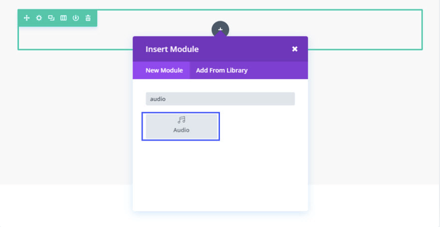
To add the Audio module to your Landing Page, click on the grey plus (+) sign in your Landing Page builder. A menu of the different types of modules available to you will open when you click on this icon.
Locate the Audio module within the list of modules and click it to add it to your page. The module list is searchable, which means you can also type the word audio and then click enter to automatically find and add the audio module!
Content Options
Anything that controls what appears in your module will always be found within this tab.
Text
The Title, Artist Name, and Album Name can be entered here. The Artist Name and Album name will appear below the Title of song, podcast episode, etc.
Audio
Click the “upload†button to upload an audio file from your Asset Manager to be used in the audio player. To remove an audio file from the module, simply delete the URL from the settings field.
Image
Cover art images can be uploaded and are displayed to the left, or above the audio controls (depending on your column width). Click the Upload button to upload an image from your Assets Manager to be used as your cover photo.
Background
Define a custom background color for your module, or leave blank to use the default color. Alternatively, upload an image from your Assets Manager to display as a background. To remove a background image, simply delete the URL from the settings field.
Amin Label
This will change the label of the module in the builder for easy identification
Design Options
Within the design tab you will find all of the modules styling options, such as fonts, colors, sizing and spacing.
Text
Set a light or dark color, orientation and shadow for your text.
Image
Define your color saturation, the contrast of light and dark areas, add a sepia filter or blur your background image. Lots of options for filters in this section. Blend Mode allows you to modify how your image blends with any other layers beneath it. Choose “normal” to return to the default option.
Text Title
Here you can change the font, size, color, spacing and line height of your Title Text. Some settings can be tailored specifically for mobile devices by clicking on the small mobile device to the right of these settings.
Title Text Size – You can drag the range slider to increase or decrease the size of your text, or you can add your desired text size value directly into the input field to the right of the slider. The input fields supports different units of measurement, which means you can input or following your size value to change its unit type.
Title Text Color – By default, all text colors will appear as white or dark gray. If you would like to change the color of your title text, choose your desired color from the color picker using this option.
Title Letter Spacing – Letter spacing affects the space between each letter. If you would like to increase the space between each letter in your title text, use the range slider to adjust the space or input your desired spacing size into the input field to the right of the slider. The input fields support different units of measurement, which means you can input or following your size value to change its unit type.
Title Line Height – Line height affects the space between each line of your title text If you would like to increase the space between each line, use the range slider to adjust the space or input your desired spacing size into the input field to the right of the slider. The input fields support different units of measurement, which means you can input or following your size value to change its unit type.
Caption Text
Here you can change the font, size, color, spacing and line height of your Caption Text. These settings apply the same rules as the Title Text Settings detailed above. Some settings can be tailored specifically for mobile devices by clicking on the small mobile device to the right of these settings.
Sizing
This is the sizing for your entire audio module. If the size goes below 100% on the slider, options for aligning your module left, center or right will automatically appear.
Spacing
Add customized margins or padding here.
Border
Set the border radius, style, width and color of your audio module.
Box Shadow
Add a shadow behind your module.
Filters
Define your color saturation, the contrast of light and dark areas, add a sepia filter or blur your entire module. Lots of options for filters in this section. Blend Mode allows you to modify how your image blends with any other layers beneath it. Choose normal to return to the default option.
Animation
Pick an animation style to enable animations for your image module. Each animation will allow you to customize it further, controlling duration, direction, and intensity.
Advanced
Within the advanced tab, you will find options such as custom CSS and HTML attributes. Here you can apply custom CSS to any of the module’s many elements. You can also apply custom CSS classes and IDs to the module.
CSS ID and Classes
Enter an optional CSS ID to be used for this module. An ID can be used to create custom CSS styling or to create links to particular sections of your page. Enter optional CSS classes to be used for this module. A CSS class can be used to create custom CSS styling. You can add multiple classes, separated with a space.
Custom CSS
Custom CSS can also be applied to the module and any of the modules internal elements. Within the Custom CSS section, you will find a text field where you can add custom CSS directly to each element. CSS input into these settings are already wrapped within style tags, so you need only enter CSS rules separated by semicolons.
Visability
This option lets you control which devices your module appears on. You can choose to disable your module on tablets, smartphones or desktop computers individually. This is useful if you want to use different modules on different devices, or if you want to simplify the mobile design by eliminating certain elements from the page.