What Is The Divider Module?
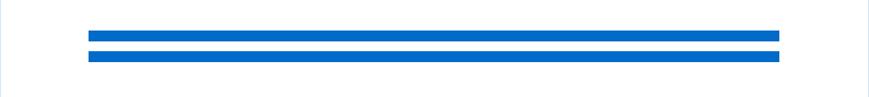
The Divider Module will add horizontal lines to your landing page to create custom spacing. This dynamic module adds structure and design to your landing page.

Adding The Divider Module
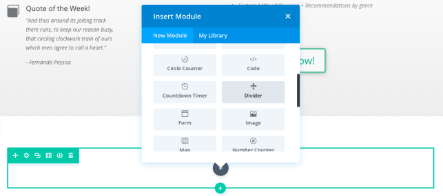
The Divider module can be added to a full width, regular, or specialty section. Add a Divider module to your landing page by clicking the grey (+) button and typing “code” to search for the module.
Once the module has been placed with the text of your choosing, you’ll be met with three customizable option sections:
- Content
- Design
- Advanced
Customizing The Divider Module
Content Options
The content options of your Divider will be where you can control the visibility of your Divider. If you choose to show your Divider then you have the option of adding a background and admin label to help your team identify it within your page.
Content Visibility
Do you want your Divider to show or would you like to hide it? Click the option to Show Divider to enable your Divider Module.
Background
Your Divider is going to contain its own colors and design, but if you’d like to really take things to the next level you have the option of adding a background to it. Choose from solid or gradient colors, an image, or even a video that you’d like to display behind your Divider.
Admin Label
This will change the label of the module in the builder for easy identification by you and your team.
Design Options
The design options will allow you to change the appearance of your Divider to fit within the styling within your page. You’ll be able to make changes to the following aspects of your Divider:
Color and Styling
Here you’ll be able to choose the color of your Divider from a collection of preset options or by adding your own Hex Color Code.
Move to the Styles tab to choose your Divider Style (type) and designate its position within your row from the following choices:
- Top
- Vertically Centered
- Bottom


Sizing
This is the sizing for your Divider Module. Your sizing options for a Divider are a bit different than that of other landing page modules. Instead of controlling the overall size of your module, you get further control over your:
- Divider Weight
- Height
- Width
Spacing
Add customized margins or padding here to help locate your Divider within your landing page. This section is crucial when separating your landing page sections.
Box Shadows
Add a shadow behind your module using one of our 7 pre-built options.

Filters
Define your color saturation, the contrast of light and dark areas, add a sepia filter or blur your entire module. We’ve included an abundance of options for filters in this section.
Blend Mode allows you to modify how your image blends with any other layers beneath it. Choose normal to return to the default option.

Animation
Animations are an excellent way to connect each section of your landing page with a fun and interactive Divider.
Pick an animation style to enable animations for your Divider Module. Each animation will allow you to customize it further, controlling duration, direction, and intensity.
Advanced
Want to make some changes that may require some additional coding? Look to the advanced tab to make changes to the way your Divider is being seen by your visitors.
CSS ID & Classes
Add additional CSS Styling by using IDs or classes. These can also be used to create links to particular sections of your page.
Custom CSS
The Advanced tab also allows for you to further design your Divider Module by adding custom CSS that you can enter based on the field of depth options available to you (Before, Main Element, and After).
Visibility
This option allows you to control which devices can view your Divider. You decide to disable the visibility for phones, tablets, and browser windows by checking the box next to the devices you’d like to exclude.