What Is The Button Module?
The Button Module can be a great asset for a Call to Action on your site.

Adding The Button Module
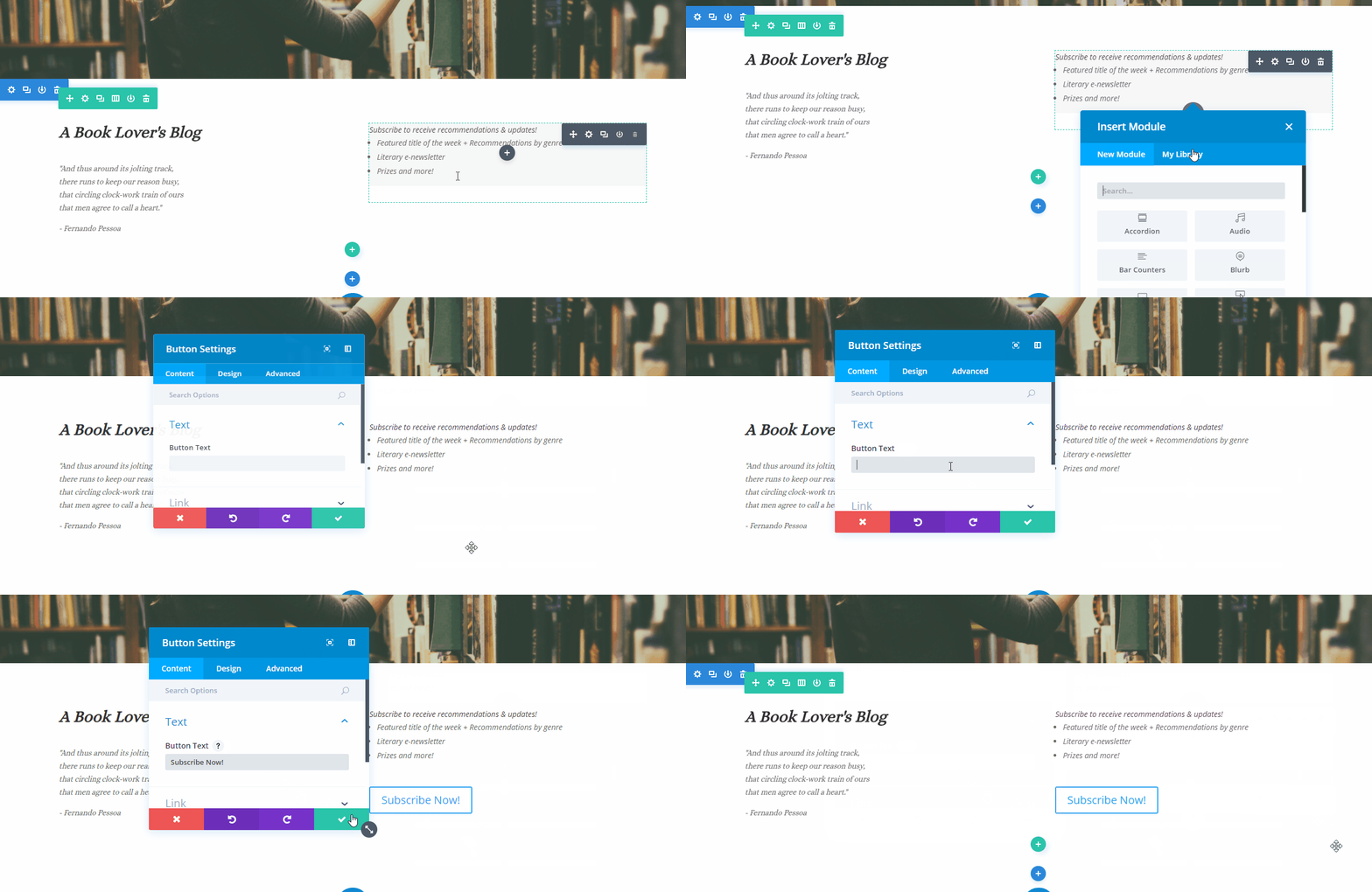
To add a Button click the grey (+) icon on your page.

Content Options
The content options of your Button will consist of three categories :
Text
Build your button here by adding the text you want your visitors to see.
Link
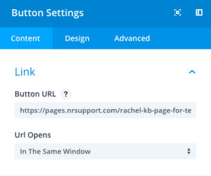
If you would like to make your button a link, input your destination URL here. Once you’ve set up your link, decide whether you want it to redirect you in your current browser or open a new tab.
Admin Level
This will change the label of the module in the builder for easy identification.
Design Options
Edit your text, button alignment, spacing and even add animation.
For detailed editing be sure to toggle “Use Custom Styles option. This will allow you adjust the text color, border, hover icon and more!

Advanced
Have a knack for coding and want to make even more changes? Look to the advanced tab where you can leverage your design skills to make changes to the way your button is being seen by your visitors.
CSS ID & Classes
Add additional CSS Styling by using IDs or classes. These can also be used to create links to particular sections of your page.
Custom CSS
The Advanced tab also allows for you to further design your button module by adding custom CSS that you can enter based on the field of depth options available to you (Before, Main Element, and After).
Attributes
The Advanced Tab also allows you to define specific button relationship attributes. Choices include:
- Bookmark
- External
- NoFollow
- NoReferrer
- NoOpener
Visibility
This option allows you to control which devices can view your button. You may disable the visibility for phones, tablets, and browser windows by checking the box next to the devices you’d like to exclude.
Remember that you always have the Net-Results Customer Success team available to help with all of your building and designing questions. Feel free to reach out if any come up, or if you’d just like to show off your one of a kind landing page!
