What is the Call to Action Module?
It’s always important to give your visitors a clear call to action. Whether you are trying to get them to purchase your product or contact you for a quote, the Call to Action module will get the clicks you need. The Call to Action module is a simple combination of a title, body text and a button. When combined with a vibrant background color, a CTA can easily catch your visitors eye.
Adding the Call to Action Module
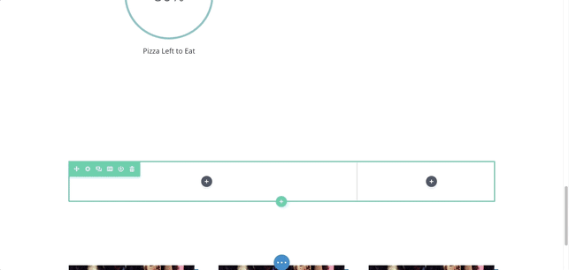
Add a CTA by clicking the grey (+) icon. Then add a Title and Button Text
Content Options
The content options of your Call to Action will consist of three categories:
Text
Build your Call to Action Module here by adding your Title and Button Text, as well as the content you’d like to display.
Link
Here you’ll be able to enter the URL of any link you’d like to use. Once this is set you then can decide if you’d like this link to open in the same window you’re currently in, or a brand new tab.
Background
Choose from a variety of background options. These choices can be solid colors, images, and even videos!
Be sure to check out our article on assets to ensure your background is as perfect as can be!
Admin Level
This will change the label of the module in the builder for easy identification.

Design Options
The Design Options will allow you to change the appearance of your Call to Action to match the appearance and tone being used on your landing page. You’ll be able to make changes to the following aspects of your module:
Text Design
Customize the font size, color, and more for your Call to Action’s Text, Title, and Body.
Call to Action Module Design
Scroll beyond the text options to customize the sizing and spacing of your Call to Action to help create the perfect balance on your landing page.
The star of your Call to Action module is your button. Once you’ve set up your text, come here to set the styles being applied to your button, as well as its alignment within the module itself.

Finish changing the appearance of your module by customizing the surrounding border, shadows, and animations or filters.
BEFORE

AFTER

Advanced
Want to make some changes that may require some additional coding? Look to the Advanced tab to make changes to the way your Call to Action is being seen by your visitors.
CSS ID and Classes
Add additional CSS Styling by using IDs or classes. These can also be used to create links to particular sections of your page.
Custom CSS
The Advanced tab also allows for you to further design your Call to Action module by adding custom CSS that you can enter based on the field of depth options available to you (Before, Main Element, and After).
You also have the ability to utilize CSS to customize the Description, Button, and Title of your Call to Action.
Visibility
This option allows you to control which devices can view your Call to Action. You can decide to disable the visibility for phones, tablets, and browser windows by checking the box next to the devices you’d like to exclude.