What Is The Circle Counter Module?

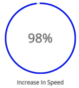
The Circle Counter is a stylized way to display statistics and informational numbers on your site. Counters deploy with lazy loading to give some visual pizazz to your page!
To add a Circle Counter Module to your landing page, click on the grey plus (+) sign in your Landing Page builder. (Simply let your cursor hover inside the specific row where you’d like to place the module and the grey + sign will appear.) A menu of the different types of modules available to you will open when you click on this icon.
Locate the Circle Counter Module within the list of modules and click it to add it to your page. The module list is searchable, which means you can also type the words circle counter and then click enter to automatically find and add this module!
Once the module has been added, you will be greeted with a list of options separated into three main groups:
- Content
- Design
- Advanced

Content Options
The content options of your Circle Counter will be where you set the title and number of your counter, the background color or image that will display behind the counter, and the admin label you and your team use to help identify it.
Take this one step further by choosing whether or not to utilize percentages by opening the Element dropdown and turning the percentage marker on or off.
Design Options
The design options will allow you to change the appearance of your counter to match the appearance and tone being used on your landing page. You’ll be able to make changes to the following aspects of your counter:
Text Design
Customize the font size, color, and more for your counter’s Title and Numbers.
Counter Design
Choose your counter’s background color, circle color, and the opacity of your circle. Scroll beyond the text options to customize the size and spacing of your counter to help create the perfect balance. Finish changing the appearance of your counter by customizing the surrounding border, shadows, and animations or filters.
Advanced
Have a knack for coding and want to make even more changes? Look to the advanced tab where you can leverage your design skills to make changes to the way your counter is being seen by your visitors.
CSS ID & Classes
Add additional CSS Styling by using IDs or classes. These can also be used to create links to particular sections of your page.
Custom CSS
The Advanced tab also allows for you to further design your counter module by adding custom CSS that you can enter based on the field of depth options available to you (Before, Main Element, and After).
The Advanced options also allow for you to use Custom CSS for Percent Container, Circle Counter Title, and the Percent Text.
Visibility
This option allows you to control which devices can view your counter. You may disable the visibility for phones, tablets, and browser windows by checking the box next to the devices you’d like to exclude.
