How to use the Text Module
The Text module allows you to elegantly display content on your landing page. This module can be used for headers as well as copy, for CTAs or blog articles. However you choose to use the Text, there are a variety of ways that you can edit and design the Text module to match the look and feel of your website.
Add and Customize the Text Module
To add a Text Module to your landing page, click the grey (+) button in the landing page builder. Once the module has been added you can type the text of your choosing and you’ll be met with three customizable option sections: Content, Design, and Advanced.
Content
The Content portion of your module will have three sections.
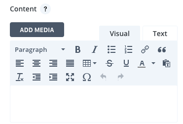
Text
Here is where you will create the content of your module. Type into the text box and use the visual buttons to customize, add symbols, lists or structure your text as a heading.
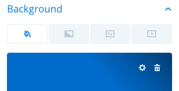
Background
This is where you can change the background color, effect, image or video playing behind your text. Once a background is added, click on the trashcan symbol to return to default settings of a transparent background.
Admin Label
This will change the label of the module in the builder for easy identification.
Design
Text
Here you can make visual edits to your Text including font, color, orientation and even adding a shadow to your text. Additionally, you can set text size, spacing and height for both desktop & mobile views. Any edits made to this section apply to the entire text module as a whole.
Heading Text
If you used any heading text (H1, H2, H3, etc) in your Content section, you are able to make edits to each of them here. Each header text is editable individually and will override any edits made to the text module as a whole. Additionally, you can set text size, spacing and height for both desktop & mobile views.
Sizing
This is the sizing for your entire text module. If the size goes below 100% on the slider, options for aligning your module left, center or right will automatically appear.
Spacing
Add customized margins or padding here.
Border
Set the border radius, style, width and color of your text module.
BoxShadow
Add a shadow behind your module.
Filters
Define your color saturation, the contrast of light and dark areas, add a sepia filter or blur your entire module. Lots of options for filters in this section. Blend Mode allows you to modify how your image blends with any other layers beneath it. Choose normal to return to the default option.
Animation
Pick an animation style to enable animations for your image module. Each animation will allow you to customize it further, controlling duration, direction, and intensity.
Advanced
Within the advanced tab, you will find options such as custom CSS and HTML attributes. Here you can apply custom CSS to any of the modules many elements. You can also apply custom CSS classes and IDs to the module.
CSS ID and Classes
Enter an optional CSS ID to be used for this module. An ID can be used to create custom CSS styling or to create links to particular sections of your page. Enter optional CSS classes to be used for this module. A CSS class can be used to create custom CSS styling. You can add multiple classes, separated with a space.
CustomCSS
Custom CSS can also be applied to the module and any of the modules internal elements. Within the Custom CSS section, you will find a text field where you can add custom CSS directly to each element. CSS input into these settings are already wrapped within style tags, so you need only enter CSS rules separated by semicolons.
Visability
This option lets you control which devices your module appears on. You can choose to disable your module on tablets, smartphones or desktop computers individually. This is useful if you want to use different modules on different devices, or if you want to simplify the mobile design by eliminating certain elements from the page.