The New Goldilocks Form Builder, provides a superior experience of form creation, which can leveraged on your site, or a Net-Results landing page. Our New Goldilocks Form Builder allows for style customization, Conditional Display, Conditional actions, and new Form field types!
Let’s dive in!
How to Create a Form
To create a new form, once the feature has been added to your account, navigate to Marketing Center > New Goldilocks Form Builder > +.
Selection of the + icon will create a new Form.
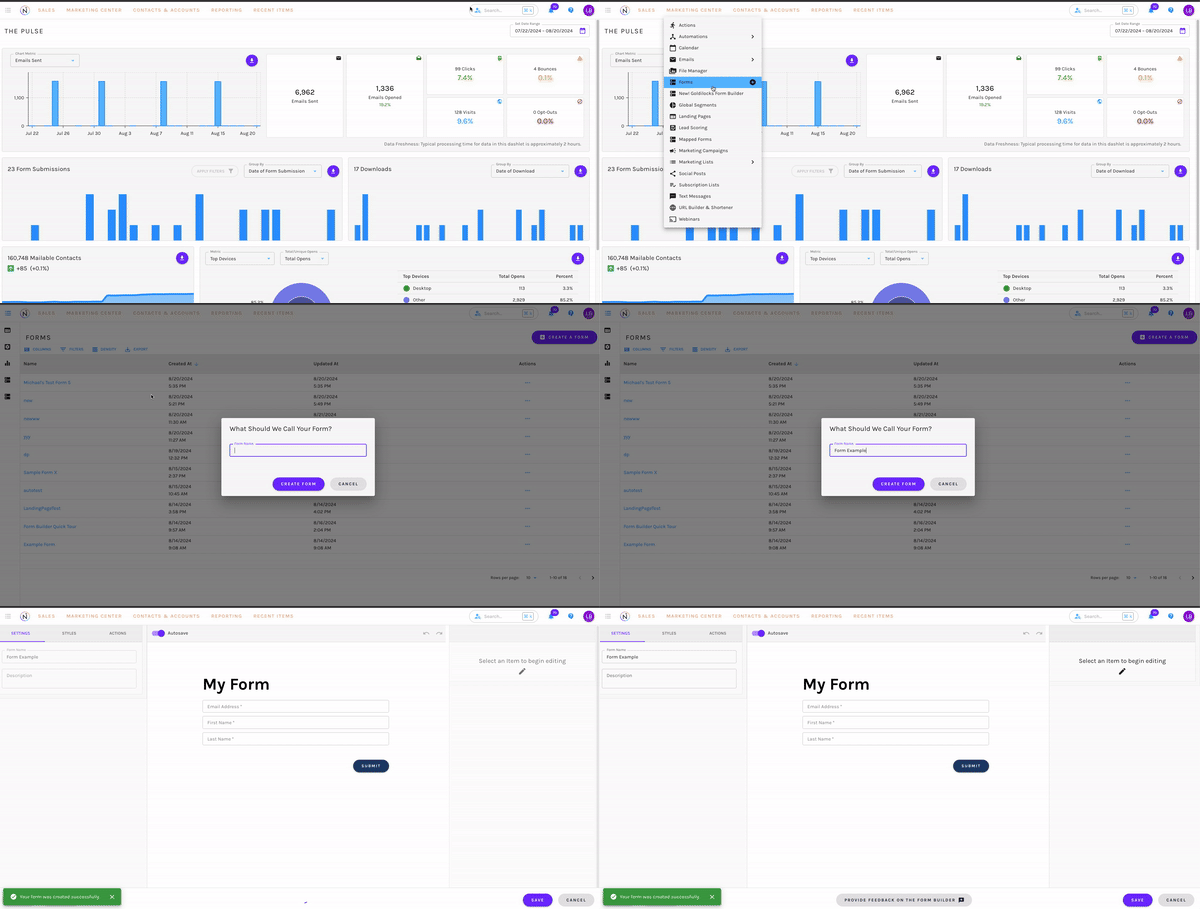
Within the New Goldilocks Form Builder Dashboard, you can also select the “Create New Form” button in the top right corner, to create a Form.

Once you create a new Form, you will first be presented with a pop-up, asking you to name your Form.
Upon naming, you will be taken to the builder. By default, you will see the form already has a few preset and mapped fields. These are:
- Text Field Titled “My Form”
- Email Address
- First Name
- Last Name
All of these fields can be edited or removed if needed!
Form Setup
When you initially create a new Form, on the left side of the builder, you will find tabs for the Settings, Styles, and Actions of the Form.
Form Settings
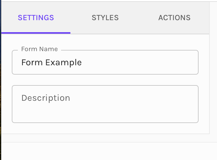
The form Settings include the Form Name and Description of the form. A description is not required, however, this is useful for future reference for yourself and other users within the account.
Form Styles
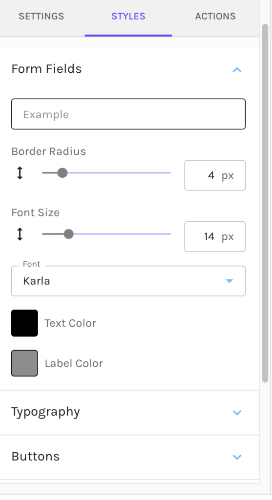
Within the Styles tab, you can customize the Form, to match your brand styles.
You also can select “Use Styles from My Site” which will leverage any CSS on the page in which you have embedded the Form.
The Styles are divided into six different sections, that can be edited. These include:
- Form Fields – Here you can set the Border Radius, Font Size, Font, Text Color, & Label Color for all Form Fields
- Typography – Here you can set for each Variant (Header 1, Header 2, etc) the Font Size, Letter Spacing, Font, & Font Color.
- Buttons – Here you can set the Font, Font Size, and Text Color of the buttons on your form.
- Design – Here you can add a Background Color, Border Color, Border Radius, and Border Width to the form.
- Dimensions – Here you can set the dimensions of your form. You have the option to stretch to fit the container or set your width or height. You can also edit the top, bottom, left & right Margins, and edit the top, bottom, left and right padding of the form.
- By default, every form comes with 16px padding on each side.
- Validation Errors- If you choose to leverage Validation Rules on any form field, here is where you can select the Error Color and Error Font Size.
Form Actions
Under the Actions, set what happens when a Contact submits the Form.
To confirm submission of the Form, you must choose one of the following:
- Redirect to a URL – Enter any URL you would like to direct your contact to upon submission
- Display a Thank You Message – Enter the Thank You Message you would like to display upon submission
Within the Actions, you will also find the Form Actions that can be leveraged upon Submission. There are two Action Types, Global Actions and Conditional Actions.
Global Vs Conditional Actions
Global Actions occur for all contacts that submit the Form
- IE for all Contacts that submit the form, add to a specific Marketing List.
Conditional Actions take place when contacts meet specific conditions of your choosing that have been selected for the Contacts that have submitted the Form.
- IE- if you want to assign all contacts whose state does match Colorado, to a specific Marketing List, use our Segment builder to select the conditions of Contact Standard Field State Does Match Colorado, and then add an Add To Marketing List action. Choose the List to add the Colorado Contacts to. Upon submission, if their state matches Colorado, they are added to this list.
To add a Conditional Action, select “Add a Conditional Action”.

Once selected, you will be prompted to add a description. This is not required, however, helpful if you will be adding multiple Conditional Actions.
To set the conditions for the action, select “Conditions”. Here you will see the Goldilocks Segment Builder, which will allow you to select the conditions you would like to isolate the group of contacts whom the action will take place for.

Once all conditions are set, select “Apply”.
From here you can set up whatever actions you would like to take for the Contacts that meet the conditions you have set.
You can set as many conditional actions as you would like to take.
Available Form Actions
The actions available within Global Actions and Conditional Actions include:
- Add to Classic Campaigns – Add to any active Classic Campaign.
- Remove from Classic Campaigns – Remove from any active Classic Campaign.
- Add to Marketing Lists – Add to any Marketing Lists of your choosing. If a list has not been created, create one on the fly by selecting “Create a New Marketing List”
- Remove from Marketing Lists – Remove from any Marketing Lists of your choosing.
- Add to Subscription Lists – Add to any Subscription Lists of your choosing. If a subscription has not been created, create one on the fly by selecting “Create a New Subscription List”
- Remove from Subscription Lists– Remove from any Subscription Lists of your choosing.
- Sunset Contact – Sunsetting temporarily prevents Contacts from qualifying for or being sent any marketing emails. You can select how long the Contacts who submit the form should be sunset for.
- Un-Sunset Contact– This will un-sunset the Contact and prevent them from qualifying for emails in the future. If a Contact is not currently sunset, this action will have no impact.
- Adjust Lead Score – Increase (or decrease) a Contact’s Lead Score. Being that Net-Results Lead Scores consist of Contact, Activity, and Engagement Scores, you may adjust any of these in any of your existing Lead Score Overlays.
- Send Autoresponder Email – Use one of your Net-Results Emails as an auto-responder. Net-Results will send the email to the Contact immediately when the form is submitted.
- Send Notification – Send an email notification to any email address of your choosing. This notification provides all kinds of great detail about the prospect that submitted your form – including how they ended up on your website and the pages they viewed before submitting your form!
- Set Lead Stage– Set/Change the Lead Stage for the Contact that has submitted your form.
- Set Field Values – Set a field value that perhaps isn’t part of the form itself (I.E. set CustomLeadScore to “Web Form”). You can now set any number of field values you would like, for each submission.
- Sync with your connected CRM – Push/update the Contact in your integrated CRM system.
Form Builder Basics
The New Goldilocks Form Builder allows you to set up your Form from top to bottom by combining 3 structural components.
Elements
Elements are the contents of your Form. These include single-line text fields, dropdowns, checkboxes, and more. Elements are indicated by an orange outline.

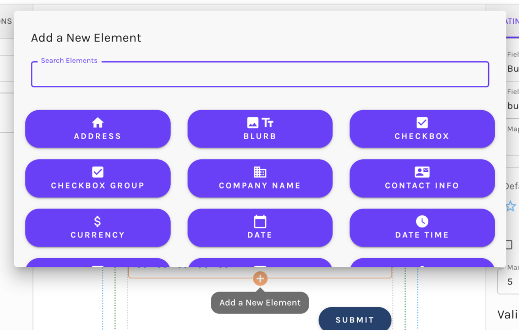
To add an Element to your form, select the + icon. Available Elements will be displayed. Easily scroll or use the search bar to find the Element you would like to use.
Available Elements
The available Elements that you can leverage on your Form include:
- Address
- Blurb
- Checkbox
- Checkbox Group
- Company Name
- Contact Info
- Currency
- Date
- Date Time
- Drop Down
- First Name
- Hidden Field
- Home Phone
- Last Name
- Link Button
- Matching Field
- Media
- Mobile Phone
- Number
- Radio Button Group
- Rating
- Submit Button
- Text
- Text Field
- Text Area Field
- True/False
- Work Phone
- Yes/No
Have any questions about mapping fields, or creating Custom Fields? Reach out to the Net-Results Customer Success Team and they can help!
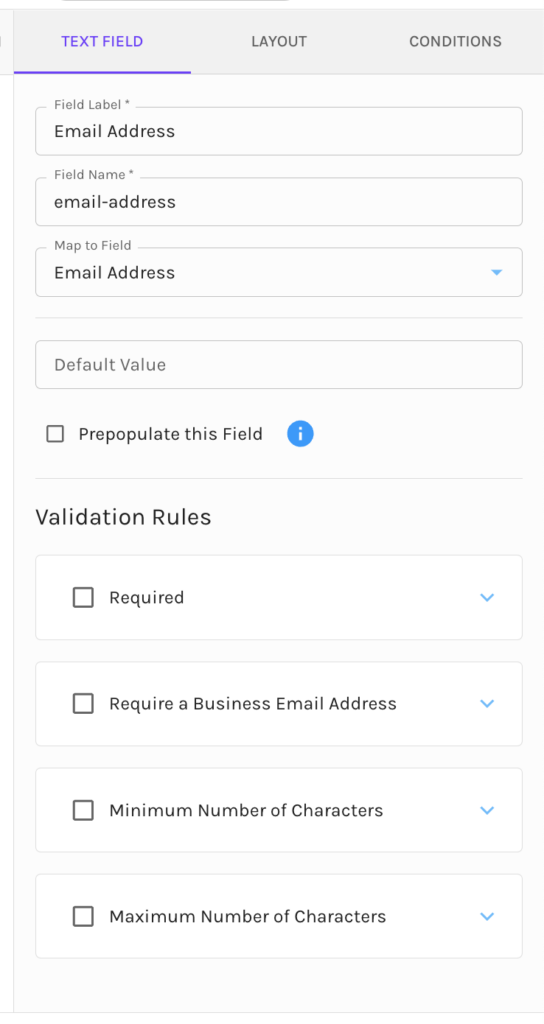
Edit Elements
Within each Element, there are options to edit the basic settings of the Element (depending on the Element type). These options include:
- The Field Label
- Default Value
- The option to pre-populate the field
- Validation Rules – these could differ depending upon the field type but for example allow for setting field requirements, minimum or maximum number of characters, etc.
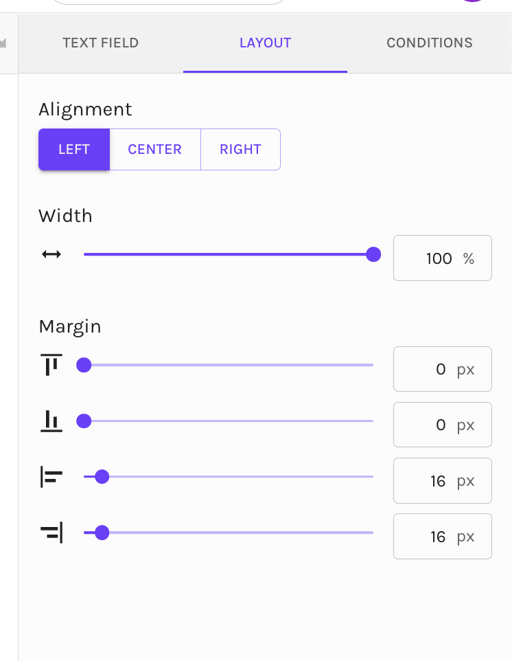
You can also edit the layout settings of each Element, including the alignment, width & margins.
Each Element allows for Conditional display, which we will cover here.
Rows
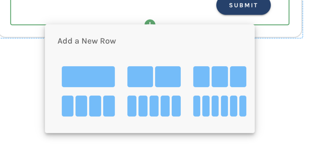
Organize Elements by keeping them in line! Rows can be full-width or have columns. There is no limit to the number of Rows that can be added to your Form. Rows are designated in green.
Sections
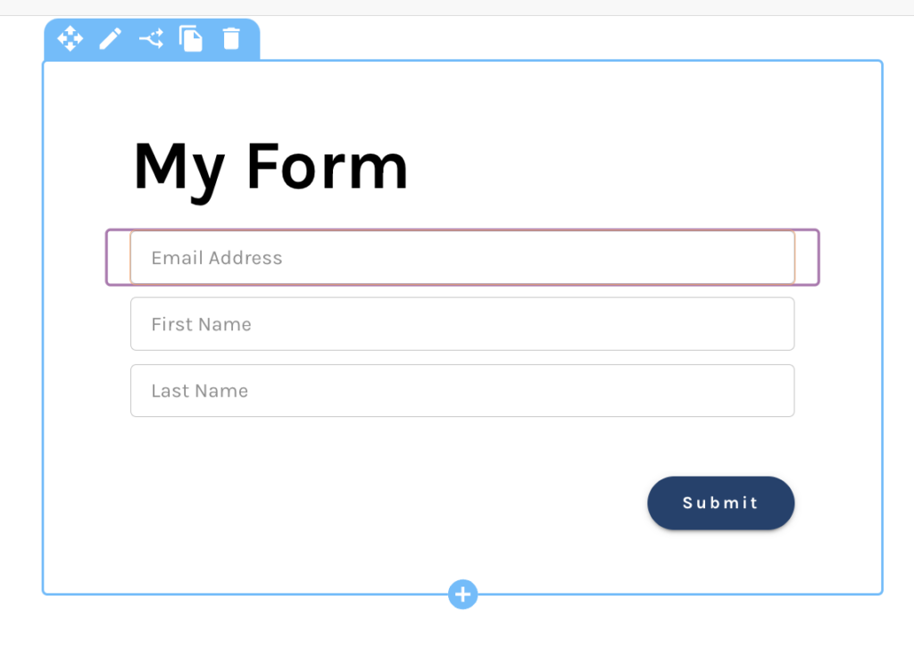
Break your form up into different Sections. Within each Section, you can add Rows and Elements. Sections are represented by blue.
Customization
Elements, Rows, and Sections allow for customization for each component. We briefly covered the Element customization, however, each will have selectable options in the top left corner of the component to set these customizations.

The options available are:
- Move- which allows you to drag and drop to wherever you would like on the Form.
- Edit – which allows for setting styles, layout, and conditions
- Conditions- shortcut to set conditions for display
- Clone- allows you to clone Element, Row, or Section to use in the Form
- Delete- delete the Element, Row, or Section
Conditional Display
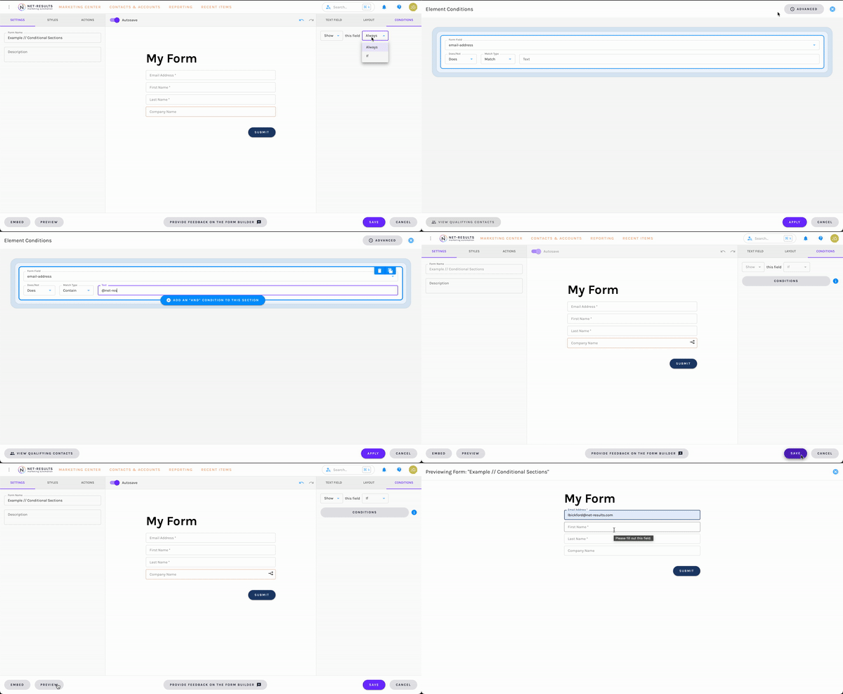
Would you like Contacts submitting the form, to be presented with specific fields, based on the selection or input of another field on your form? If so, Elements, Rows, and Sections, all allow for Conditional Display. Setting this up is easy and can be set based on form fields, Contact fields (standard & custom) & Account fields (standard & custom).
To set a conditional display for any of these fields, select either the “Edit” option of the component or “Display This Element Conditionally”.
Once selected you have some options for display. These include:
Show this field Always (default)
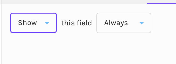
Hide this field Always
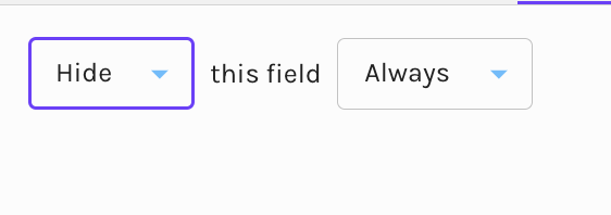
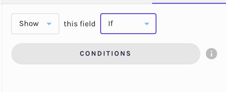
Show this field If
Hide this field If
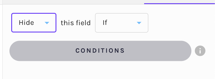
You will notice, that “Show this field If”, and “Hide this field If”, prompt you to set conditions. Selection of the button “Conditions” will take you to the Net-Results Segment builder, where you can set your conditions for display. Again these include the Form Fields from this specific Form, Contact fields (values stored on your Contact in Net-Results) & Account fields (values stored on the Account of the Contact, in Net-Results).

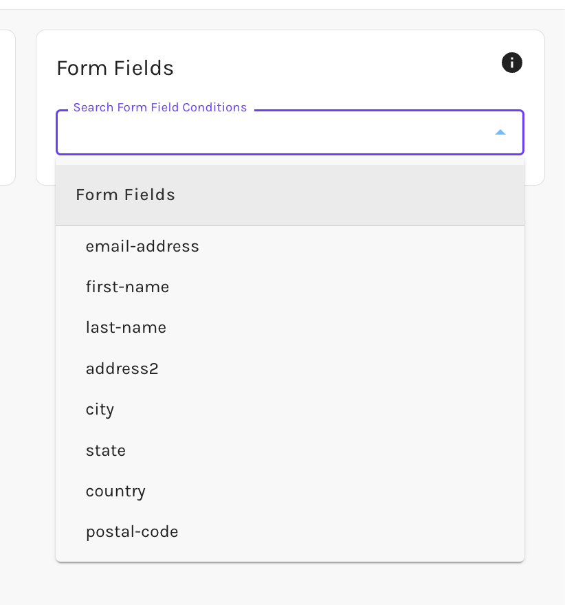
You can combine as many conditions as you would like for the field to display.
Form Builder FAQ
As a reminder, this is the initial launch of our New Goldilocks Form Builder. You will see changes over time. Please keep an eye on the Goldilocks login page, for updates!
We love feedback here at Net-Results. If you have any feedback on the New Form Builder, please let us know either via the Form within the builder or by reaching out to the Customer Success team at support@net-results.com. They can help answer any questions you may have, or provide a live walkthrough of the New Goldilocks Form Builder.
